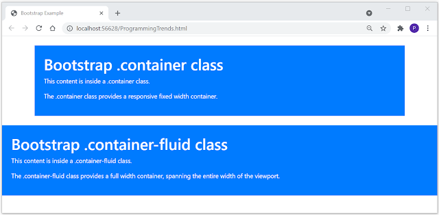
Bootstrap requires a containing element to wrap site contents. Containing element is called as container.
In bootstrap there are two container classes to choose from :
1. .container class provides a responsive fixed width container. Use the .container class to create a responsive, fixed-width container.
2. .container-fluid class provides a full-width container, spanning the entire width of the viewport. Use the .container-fluid class to create a full-width container, that will always span the entire width of the screen (width is always 100%).
Bootstrap Container Example
<!DOCTYPE html>
<html lang="en">
<head>
<title>Bootstrap Example</title>
<meta charset="utf-8">
<meta name="viewport" content="width=device-width, initial-scale=1">
<link rel="stylesheet" href="https://maxcdn.bootstrapcdn.com/bootstrap/4.5.2/css/bootstrap.min.css">
<script src="https://ajax.googleapis.com/ajax/libs/jquery/3.5.1/jquery.min.js"></script>
<script src="https://cdnjs.cloudflare.com/ajax/libs/popper.js/1.16.0/umd/popper.min.js"></script>
<script src="https://maxcdn.bootstrapcdn.com/bootstrap/4.5.2/js/bootstrap.min.js"></script>
</head>
<body>
<div class="container bg-primary text-white p-4 mt-4">
<h1>Bootstrap .container class</h1>
<p>This content is inside a .container class.</p>
<p>The .container class provides a responsive fixed width container.</p>
</div>
<div class="container-fluid bg-primary text-white p-4 mt-4">
<h1>Bootstrap .container-fluid class</h1>
<p>This content is inside a .container-fluid class.</p>
<p>The .container-fluid class provides a full width container, spanning the entire width of the viewport.</p>
</div>
</body>
</html>


0 comments:
Post a Comment
Please do not enter any spam link in the message box.