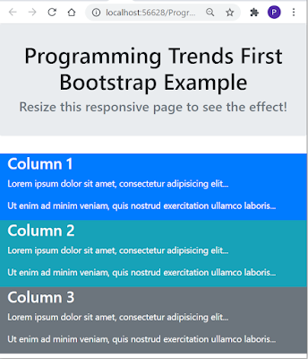
Responsive web design (Responsive Website) is about creating websites that automatically adjust themselves to look good on all devices, from small phones to large desktops. A responsive web design (Responsive Website) will automatically adjust for different screen sizes and viewports.
This will set the viewport of your page, which will give the browser instructions on how to control the page's dimensions and scaling.
Viewport is the browser window size. 1vw = 1% of viewport width. If the viewport is 50cm wide, 1vw is 0.5cm.
Setting the viewport
To create a responsive website, it is required to add the <meta> tag with the name "viewport" to all your web pages.<meta name="viewport" content="width=device-width, initial-scale=1.0">
This will set the viewport of your page, which will give the browser instructions on how to control the page's dimensions and scaling.
Viewport is the browser window size. 1vw = 1% of viewport width. If the viewport is 50cm wide, 1vw is 0.5cm.
Responsive Web Design output

