Bootstrap Badges are used to add additional information to any content.
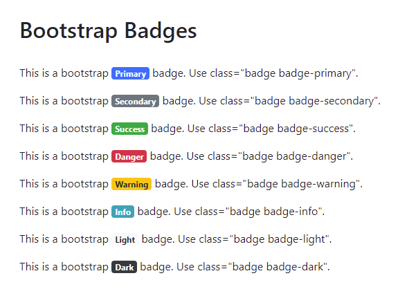
To display information as badge use .badge class together with a contextual class like .badge-primary, .badge-secondary, badge-success, badge-danger, badge-warning, badge-info, badge-light, badge-dark etc.. within <span> elements to create rectangular badges. Badges scale to match the size of the immediate parent element by using relative font sizing and em units. Badges can be used as part of links or buttons to provide additional information.
Bootstrap Badges Example
Code :
<!DOCTYPE html>
<html lang="en">
<head>
<title>Bootstrap Badges Example</title>
<meta charset="utf-8">
<meta name="viewport" content="width=device-width, initial-scale=1">
<link rel="stylesheet" href="https://maxcdn.bootstrapcdn.com/bootstrap/4.5.2/css/bootstrap.min.css">
<script src="https://ajax.googleapis.com/ajax/libs/jquery/3.5.1/jquery.min.js"></script>
<script src="https://cdnjs.cloudflare.com/ajax/libs/popper.js/1.16.0/umd/popper.min.js"></script>
<script src="https://maxcdn.bootstrapcdn.com/bootstrap/4.5.2/js/bootstrap.min.js"></script>
</head>
<body>
<div class="container">
<h2>Bootstrap Badges</h2>
<p>
This is a bootstrap <span class="badge badge-primary">Primary</span> badge. Use class="badge badge-primary".
</p>
<p>
This is a bootstrap <span class="badge badge-secondary">Secondary</span> badge. Use class="badge badge-secondary".
</p>
<p>
This is a bootstrap <span class="badge badge-success">Success</span> badge. Use class="badge badge-success".
</p>
<p>
This is a bootstrap <span class="badge badge-danger">Danger</span> badge. Use class="badge badge-danger".
</p>
<p>
This is a bootstrap <span class="badge badge-warning">Warning</span> badge. Use class="badge badge-warning".
</p>
<p>
This is a bootstrap <span class="badge badge-info">Info</span> badge. Use class="badge badge-info".
</p>
<p>
This is a bootstrap <span class="badge badge-light">Light</span> badge. Use class="badge badge-light".
</p>
<p>
This is a bootstrap <span class="badge badge-dark">Dark</span> badge. Use class="badge badge-dark".
</p>
</div>
</body>
</html>
</body>
</html>
Output :
Bootstrap Badges With Pill Example
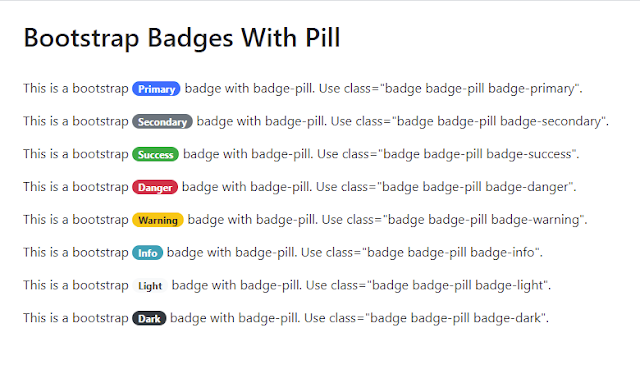
To display badges more rounded with a larger border-radius use the badge-pill utility class. Below is the example of a badge-pill.Code :
<!DOCTYPE html><html lang="en">
<head>
<title>Bootstrap Badges With Pill Example</title>
<meta charset="utf-8">
<meta name="viewport" content="width=device-width, initial-scale=1">
<link rel="stylesheet" href="https://maxcdn.bootstrapcdn.com/bootstrap/4.5.2/css/bootstrap.min.css">
<script src="https://ajax.googleapis.com/ajax/libs/jquery/3.5.1/jquery.min.js"></script>
<script src="https://cdnjs.cloudflare.com/ajax/libs/popper.js/1.16.0/umd/popper.min.js"></script>
<script src="https://maxcdn.bootstrapcdn.com/bootstrap/4.5.2/js/bootstrap.min.js"></script>
</head>
<body>
<div class="container">
<h2>Bootstrap Badges With Pill</h2>
<p>
This is a bootstrap <span class="badge badge-pill badge-primary">Primary</span> badge with badge-pill. Use class="badge badge-pill badge-primary".
</p>
<p>
This is a bootstrap <span class="badge badge-pill badge-secondary">Secondary</span> badge with badge-pill. Use class="badge badge-pill badge-secondary".
</p>
<p>
This is a bootstrap <span class="badge badge-pill badge-success">Success</span> badge with badge-pill. Use class="badge badge-pill badge-success".
</p>
<p>
This is a bootstrap <span class="badge badge-pill badge-danger">Danger</span> badge with badge-pill. Use class="badge badge-pill badge-danger".
</p>
<p>
This is a bootstrap <span class="badge badge-pill badge-warning">Warning</span> badge with badge-pill. Use class="badge badge-pill badge-warning".
</p>
<p>
This is a bootstrap <span class="badge badge-pill badge-info">Info</span> badge with badge-pill. Use class="badge badge-pill badge-info".
</p>
<p>
This is a bootstrap <span class="badge badge-pill badge-light">Light</span> badge with badge-pill. Use class="badge badge-pill badge-light".
</p>
<p>
This is a bootstrap <span class="badge badge-pill badge-dark">Dark</span> badge with badge-pill. Use class="badge badge-pill badge-dark".
</p>
</div>
</body>
</html>

